Colour Theory
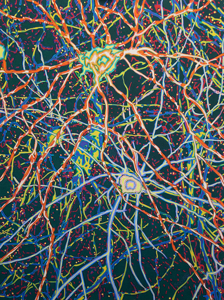
Every Solveig artwork demonstrates an intimacy with colour and a talent for choosing colours that together contrast and vibrate to evoke an emotional response.
What is Colour Theory?
Colour theory is a way to navigate your colour choices in your work.
There are three primary colours:
- red
- yellow
- blue
And three secondary colours:
- purple
- green
- orange
And any combination of any of these colours creates every perceivable hue possible.
Then there is black and white, both of which are not colours. Black is a shade and white is a tone. Black added to any colour or combination darkens while adding white lightens.
The Colour Wheel
Look at a Colour Wheel. Red, yellow and blue are at equidistant points around the circle. Purple locates halfway between red and blue, green between blue and yellow, and orange between red and yellow. Create a colour wheel yourself where you mix colours from the primary colours and observe the vast range of incremental colours you can access.
When you understand how to create the colour of your choice you become aware of its psychology. Colour has archetypal meaning and elicits an emotional response. Colour theory allows you to ‘load up’ your composition with emotive communication.
Pastel colours create harmony, soft and balanced; red, orange and earthy browns create passion; tension and drama is created by strong opposites competing for dominance. Reds and pinks come forward, greens and blues recede. Yellow lightens with sunlight and purple looms in the shadow and the secret.
There are many inferences when you compose your palette. Nothing is right or wrong, only effective and brilliant or not.
The Impressionists
My use of colour theory is heavily influenced by the Impressionist and Post Impressionist artists. It was a revolutionary time for art, and artists were breaking free of the church and elite ownership of art and artists. Impressionists were intent on representing their own lives and environs and finding the magic in the ordinary.
Light became a fascination, the way it lands on form and is captured by its shade and highlight. Impressionists observed, through half closed eyes that shadows and light were best expressed through complimentary opposite colours. Impressionists dropped the use of black to shade their works and instead used opposite colour combinations.
They used loaded brushstrokes of raw colour juxtaposed beside its opposite colour to create edge and depth. They wanted to capture the present moment, with its light and atmosphere and mood. Colour applied in this way is perceived by the eye as spacial and energetic.
The Psychology of Colour
The perception of colour is personal. Not everyone has the same subconscious response to colours. It depends on association and training. We all give meaning to the colour in our lives and our psychology is woven around the archetypal experiences of each colours’ frequency affecting us. From this, we create complex coloured externalisations of our inner beliefs.
Some of us paint in black and white expressing the deep polarisation of life on earth in a human body. Some of us swim in aqua waters with golden sand and endless blue sky. Wherever you find yourself, colour theory is a journey of self discovery.
In my experience, the relationship you have with colour when it becomes intimate and passionate will become the great love of your life.
Dendrites – The Scope Series by Solveig. 2016.

